
Douglas Rissing
Douglas Rissing
The news narrative surrounding the current US economy is mixed, with pundits on both sides of the political aisle trying to use economic performance as a tool to boost their sides' popularity.
Figures like GDP, inflation, and unemployment are staples in this discussion but do not tell the whole picture and leave out some data points that should give us pause when believing the narratives pushed by news outlets.
In this article, I will discuss three charts I have not seen the mainstream media present, and how they should change our perspective on the US economy and our US-based investments.
Of course, we can't leave out the "big three" figures that are most often quoted by anyone discussing modern economics; GDP, inflation, and unemployment.
Figure 1 (FRED)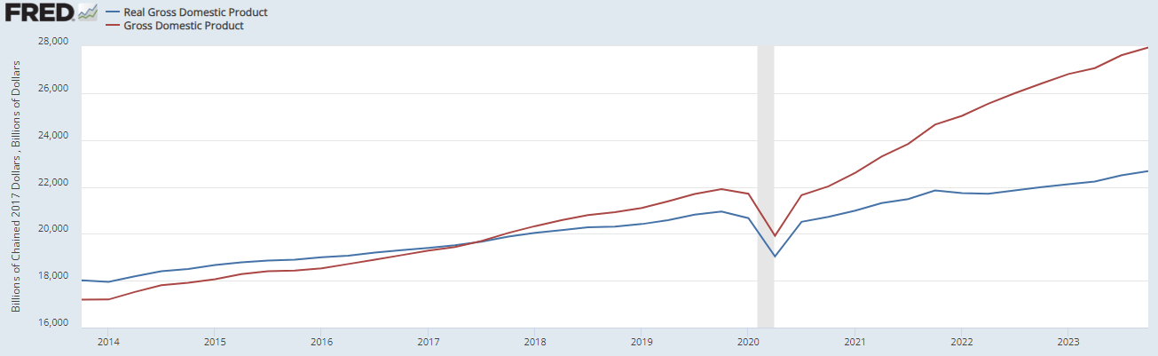
While both real and gross GDP are rising, there is a stark divergence between the two figures that has been widening since the pandemic and stagflation episode in 2022.
Figure 2 (FRED)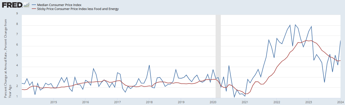
Inflation has begun to rear its ugly head again, with a spike in January. This has been driven largely by food and energy. The red line in Figure 2 is less food and energy, and it is still trending down and flat while the rest of CPI has spiked.
Unemployment has remained low since its recovery from the pandemic layoffs. That doesn't mean that everything is back to normal, however.
Figure 3 (FRED)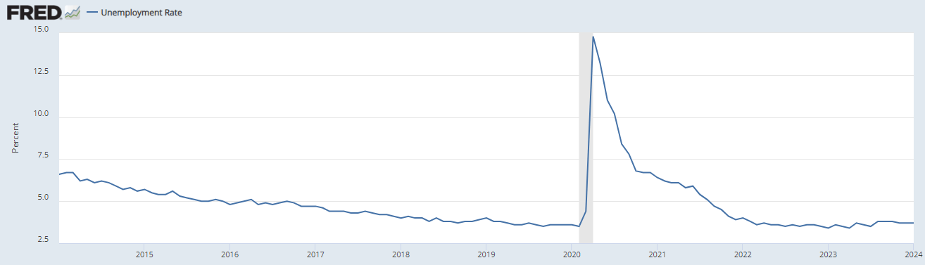
One of the phenomena that has been observed since the pandemic layoffs is the lack of returning to work. The unemployed classification only counts if someone is actively looking for work. This means that Figure 3 doesn't count people who've given up looking or have turned to work in the grey market like cash jobs, gig work, etc.
Figure 4 (FRED)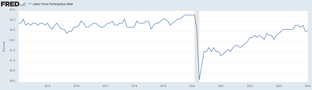
The labor force participation rate shows us that not everyone returned to work, and we've shown signs of plateauing around the 62.5% mark, lower than the pre-pandemic 63%. This may seem like a small difference, but it has a massive effect on the labor market.
This is primarily because unemployment figures affect those with lower levels of education more, meaning that these vacancies are more often service jobs ripe for being replaced by automation. Having an undergraduate degree or higher puts one in the lowest categories of unemployed folks, while those without see consistently higher levels with great levels of exaggeration during crises like 2020.
Figure 5 (FRED)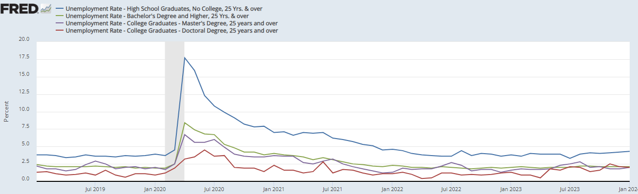
We can see from our rising GDP, mixed inflation, and lowering unemployment that we are in an "expansion phase" of the typical "business cycle," although I am hesitant to tell anyone to use that concept as a basis for investing.
These figures are projecting strength in the economy, with the inflation record being the only major drawback. I believe that the economy is stronger than most people want to believe, and there are other figures that we can look at to see this for ourselves.
This chart shows the amount of disposable income the average household spent on debt servicing.
Figure 6 (FRED)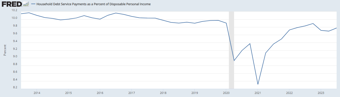
This chart is unusual because it shows a picture not widely shared by the mainstream economic coverage: Americans are spending less of their incomes on debt today than they were before the pandemic, despite the accrual of tremendous amounts of debt since then.
Figure 7 (FRBNY)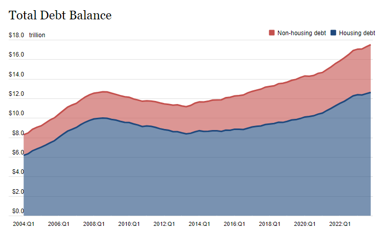
So we can see something important to note here: the nominal debt number is not the whole picture. As inflation is rising, debtors gain the difference, since they were able to spend the money before it was inflated and are paying back the loan with post-inflation dollars that are worth less in purchasing power.
And it's not just housing-related debt that's on the rise. It's all debt.
Figure 8 (FRBNY)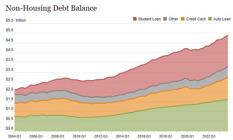
But just like Figure 6, we can subvert this higher debt is bad narrative with figures like this, that show delinquency rates falling in almost all categories, with the exception of credit cards, which are not approaching the levels of delinquency we saw in the pandemic.
Figure 9 (FRBNY)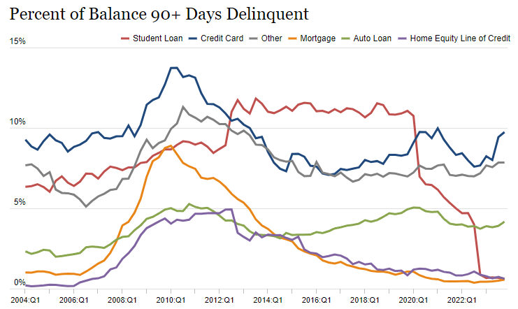
Generally, when looking at all loans, we see a mixed picture, with current lows being historical but trending up since last quarter.
Figure 10 (FRED)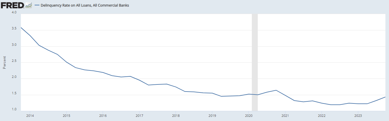
That uptick is not enough to call a trough in delinquencies but should give us some pause.
I believe this data is overall positive, and shows that Powell may get his "soft landing," after all. Even if it takes another two or three years for these figures to level out and normalize at these new lows, as we've seen before in the mid-2010s, investors should be positioning themselves now to take advantage of these conditions.
The consumer is weaker than expected, given the positive economic outlook. The personal savings rate, which tracks the percentage of disposable income that is saved or invested at the end of each month, shows us that consumers are saving less post-pandemic than they were before.
Figure 11 (FRED)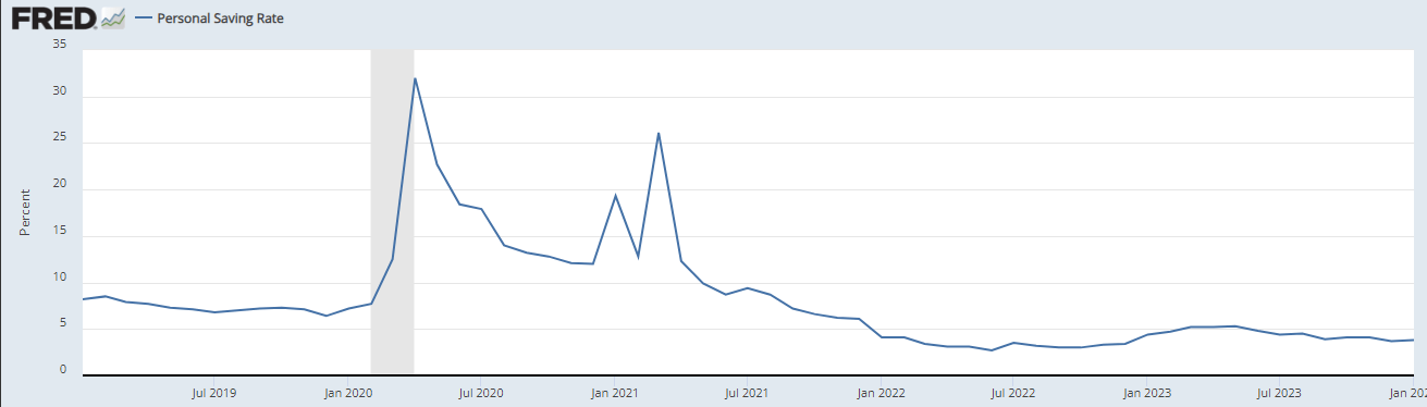
Household income has dropped, even as personal income has stayed even, indicating that households in general are seeing and feeling that drop off in employment levels mentioned in Figure 4.
Figure 12 (FRED)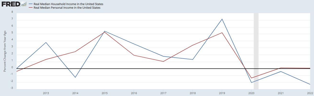
The consumer is weaker than the economy, which means that the difference is being picked up elsewhere. Corporations have been raising their profits in the past few years. The following chart shows the gap between corporate profits before and after dividends are paid out.
Figure 13 (FRED)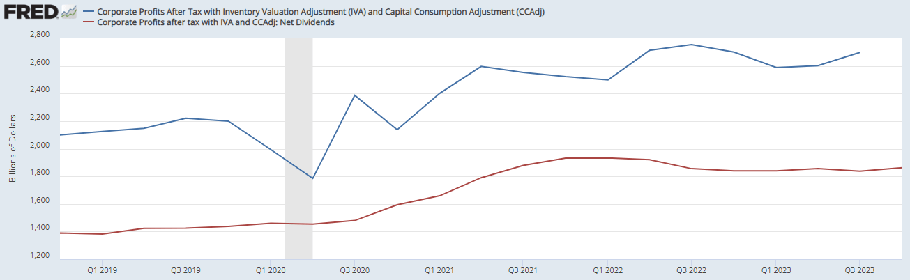
So who's the one pocketing the gains in the US economy? Investors.
I have two ideas I want to share.
First, broad-market equity and bond exposure to the US is still a go-to and remains my equity exposure of choice. Despite the S&P 500 hitting record highs, I don't see an end to the run-up in sight with how the macroeconomic conditions are shaking out.
I am long the US via two ETFs; first, my equity exposure is via the Invesco S&P 500 GARP ETF (SPGP), which I wrote about in more detail here. This ETF screens for growth companies trading at lower-than-normal multiples, providing investors exposure to the market's leading stocks without overpaying too much.
The other way I am long the US markets is via my bond exposure. I have written extensively about fixed income, and recommend taking a look at my income portfolio, which is currently yielding 7%. My largest single holding in that portfolio is the iShares iBoxx Investment Grade Corporate Bond ETF (LQD). This ETF holds a broad range of corporate bonds rated BBB and above.
Secondly, I want to warn investors to consider the US' strength when investing internationally. Currently, I like currency-hedged exposure to foreign stocks over non-hedged. Consider two ETFs, the iShares MSCI Japan ETF (EWJ) and the iShares Currency Hedged MSCI Japan ETF (HEWJ), where the currency hedging has produced outperformance.
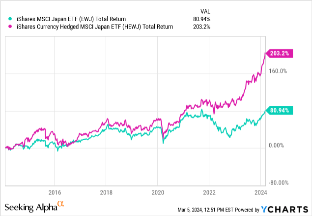
Until the US economy and dollar cool off compared to the rest of the world, currency-hedged exposure is the way to go for international funds. This goes double for emerging markets, where currencies are unpredictable and prone to extreme episodes of inflation, like in Turkey, Argentina, etc.
The US economy is flashing mixed signals but is still in mostly positive territory. There is room for caution, and the recommendation I have is to hold onto investments in US equities and bonds, screening for quality and watching the multiples we're buying at.
I also recommend currency-hedged international exposure, as the dollar's gains are tough to swallow when converting back from a foreign currency.
For now, investors should keep an eye on some of these metrics, most importantly the chart in Figure 6, as it gives context to the massive amounts of debt Americans sustain. The nominal debt isn't a problem, but if we begin to see more and more of household disposable income spent on its servicing, it becomes a problem.
Thanks for reading.